Responsive video delivery
August 20, 2020 - Doug Sillars
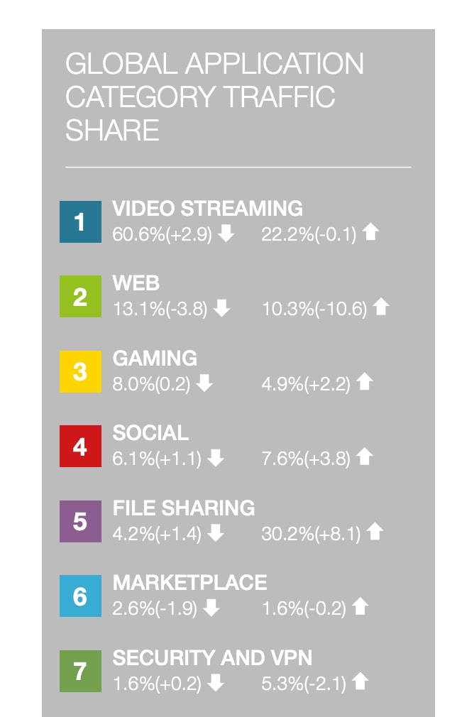
Video is the future of the web. In September 2019, Sandvine reported that video accounted for 60% of all network traffic on the web.
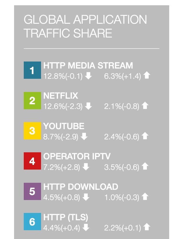
Many will immediately think of Netflix, Hulu, Disney+ and other OTT video delivery providers. Interestingly, this report shows that smaller streaming companies and user generated media streams use more bandwidth than Netflix or YouTube!
The growth of video by everyone else is far surpassing that of the big streaming providers. We at api.video are excited to help you join in on the surge of video on the web.
Why Video Streaming?
I'm often asked, "why should I stream video? Can't I just add the mp4 to my page and be done with it?" The answer is that yes, you can just do this, but it comes at a price to your users.
When you put a mp4 video on your page, you get to place one version of the video:
<video autoplay muted controls loop>
	<source  src="myBigVideo.mp4">
</video>
If 'myBigVideo.mp4' is 1080p, that 1080p video is served to all devices - even mobile phones. A 1080p video has 4x the pixels of a 720p video, which means that smaller devices (even most smartphones in portrait mode) cannot show all the pixels. The device has to process the file (taking time and draining battery), to throw away 75% of the data downloaded. This is wasteful for not only the user, but for your servers ("reduce the load on your servers by 75% with this one easy trick!").
Is responsive video a thing?
Unfortunately, the video tag is not responsive. For those who haven't run across the concept of responsiveness on the web, it is perhaps best described for images. Using the img tag with srcset and sizes attributes, you can deliver an image appropriate to the size of the screen.
Here's the example from MDN:
<img srcset="elva-fairy-480w.jpg 480w,
             elva-fairy-800w.jpg 800w"
     sizes="(max-width: 600px) 480px,
            800px"
     src="elva-fairy-800w.jpg"
     alt="Elva dressed as a fairy">
This code tells the browser, if the screen is under 600px, serve the 480px wide image. If the screen is larger than 600px, serve the 800px image. The advantage here is that for smaller screens, you don't need to download a huge image, since the screen cannot display most of the pixels downloaded.
Alas, there is no responsive video tag.
I agree that responsiveness would be really cool to have for video: being able to serve 720p video (or smaller) on mobile, and 1080p (or larger) video on desktop. But this was removed several years ago from all browsers (think Chrome 34), and is not going to come back.
What can we do to make our video responsive?
Here's where streaming comes in
You may have heard of adaptive bitrate streaming. When streaming video - it is common to encode different sizes of the same video (video dimensions and bitrates). Since you have several different streams of your video, the player can choose to display the perfect stream for the device watching the video!
Even cooler - if you are on a large screen, but the network is slow - the player will find the highest resolution video that can support continuous playback based on your network conditions! (It may not look fabulous, but it plays - which may be more important.)
So, how do you pick the right sizes, encoding, quality and bitrate for your streams? Well, you don't have to. Just upload your video to api.video, and we'll handle all of these decisions for you - letting you focus your energies on other development tasks.
That's right - just by uploading your video to api.video, your bigMovie.mp4 file is immediately transcoded into multiple streams to ensure fast, responsive playback on any device.
The current (August 2020) streaming profiles for api.video are:
| Resolution | FPS | Video Bitrate | Audio Bitrate |
|---|---|---|---|
| 240p | 18 | 250 KBPS | 96 KBPS |
| 360p | 25 | 800 KBPS | 128 KBPS |
| 480p | 25 | 1400 KBPS | 128 KBPS |
| 720p | 25 | 2600 KBPS | 128 KBPS |
| 1080p | 30 | 4400 KBPS | 128 KBPS |
| 2160p (4k) | 60 | 16000 KBPS | 128 KBPS |
Note: we will not upscale your video. This means that if you upload a 720p video, your stream will contain the 720p video and smaller versions - 1080p and 4k versions will not be available.
As you can see in the chart above, your video can now play on networks with as little as 400 KBPS of bandwidth (250 for video + 96 for audio + a little overhead). It will be just 240p, but it will play. And your customers on a giant 4K screen (with a big network pipe), will see the same video in its full 3840 x 2160 glory.
We've recorded a demo where we use Chrome devTools to resize the screen, and you can see the video segments change. We also adjust the netweork speed, and the player quickly adapts to the new conditions - optimizing the video for every situation.
Conclusion
Video is going to be an integral part of the web going forward. To ensure that all of your videos are properly sized for all of your users - from the smallest smartphone/smartwatch screen to the largest TV, your video must be responsive -meaning that they will be properly sized for both the screen and the network conditions of your users.
Streaming video is the best way to make your videos responsive. If you use api.video, it is also the easiest way, because all videos uploaded to api.video are delivered with a player that ensures responsiveness and fast playback for all users - no matter the device, no matter their network connection.
Sign up today, and give it a try. If you have any questions, feel free to reach out to our community forum.
Follow our latest news by subscribing to our newsletter
Create your free account
Start building with video now


