api.video Analytics: Create a pie chart showing what operating system is most popular to view
April 12, 2021 - Erikka Innes in Analytics, JavaScript, Python
You can use api.video's analytics with Observable to create a lot of different charts. We've already made a choropleth, a map that shows viewer density by marker size, and now today we'll create a pie chart.
Prerequisites
For this tutorial, you'll need:
- api.video account - sign up here
- Observable account - sign up here
- Python installed with requests, pandas, csv
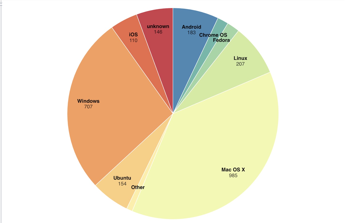
Example pie chart showing what platforms people view demo videos from
Retrieve Your Data
To retrieve your data, you're going to authenticate with your api.video API key. Then when you have the token, you retrieve all live streams, VODs and the sessions associated with them. Before going into the code sample, if you want you can check out the API reference documentation for live streams here: Live streams
import requests
import csv

# Get api.video token

url = "https://ws.api.video/auth/api-key"

payload = {"apiKey": "your api key here"}
headers = {
    "Accept": "application/json",
    "Content-Type": "application/json"
}

response = requests.request("POST", url, json=payload, headers=headers)
response = response.json()
token = response.get("access_token")

# Takes a response from the first query and determines if it's paginated
# Returns data in a list you can iterate over for information for sessions
# or videos and live streams.

def paginated_response(url, token):
    headers = {
    "Accept": "application/json",
    "Authorization": token
    }
    json_response = requests.request("GET", url, headers=headers, params={})
    json_response = json_response.json()
    total_pages = 1
    if json_response is not None:
        total_pages = json_response['pagination']['pagesTotal']
    video_info = list(json_response['data'])
    if total_pages > 1:
        for i in range(2, total_pages +1):
            querystring = {"currentPage":str(i), "pageSize":"25"}
            r = requests.request("GET", url, headers=headers, params=querystring)
            r = r.json()
            video_info = video_info + r['data']
    return video_info

livestreams = paginated_response("https://ws.api.video/live-streams", token)

videos = paginated_response("https://ws.api.video/videos", token)

with open('master_sessions.csv', 'w', newline='') as csv_file:
    fieldnames = ['Title', 'Type', 'AssetID', 'SessionID', 'OS_Name', 'OS_Shortname', 'OS_Version']
    writer = csv.DictWriter(csv_file, fieldnames)
    writer.writeheader()

    for item in livestreams:
        live_url = 'https://ws.api.video/analytics/live-streams/' + item['liveStreamId']
        title = item['name']
        ID = item['liveStreamId']
        print('when are we arriving here')
        live_sessions = paginated_response(live_url, token)
        for item in live_sessions:
            if item['location']['city'] is None:
                item['location']['city'] = 'unknown'
            if item['location']['country'] is None:
                item['location']['country'] = 'unknown'
            writer.writerow({'Title':title, 'Type':'ls', 'AssetID':ID, 'SessionID':item['session']['sessionId'], 'OS_Name':item['os']['name'], 'OS_Shortname':item['os']['shortname'], 'OS_Version':item['os']['version']})

    for item in videos:
        video_url = 'https://ws.api.video/analytics/videos/' + item['videoId']
        title = item['title']
        ID = item['videoId']
        video_sessions = paginated_response(video_url, token)
        for item in video_sessions:
            if item['location']['city'] is None:
                item['location']['city'] = 'unknown'
            if item['location']['country'] is None:
                item['location']['country'] = 'unknown'
            writer.writerow({'Title':title, 'Type':'video', 'AssetID':ID, 'SessionID':item['session']['sessionId'], 'OS_Name':item['os']['name'], 'OS_Shortname':item['os']['shortname'], 'OS_Version':item['os']['version']})
Create a DataFrame with Your CSV File
With this code snippet, we'll create a dataframe, and drop information down to only what we'll need for our pie chart. The other information was included for reference, and in case you want to do something else with this subset of data.
import pandas as pd

df = pd.read_csv("master_sessions.csv")

df_grouped = df.groupby(['OS_Name']).agg(Count=pd.NamedAgg(column="OS_Name", aggfunc="count"))
df_grouped.to_csv('pie.csv')
The code sample assumes your csv file is in the same folder as your code.
Now we're ready to build our map in Observable.
Configure Observable
In this section, we walk through how to get your pie chart set up on Observable. If you haven't done so, sign up for an Observable account. Then do the following:
- Navigate to our Observable notebook Pie Chart for api.video Analytics Data.
- Click the three dots in the upper right corner. A menu opens.
- From the menu, choose Fork. Now you have your own copy of the map to edit and play around with.
- Click the three dots in the upper right corner again and choose File attachments.
- Add the csv file you made using the pandas code.
Everything should work. You might find that the count for each operating system doesn't show, or the operating system name doesn't show if the pie slice would be too small. You can tweak the titles in the CSV to make them shorter, leave it, or you can try a Donut Chart to see if that looks better.
There's lots of things you can learn from your data.

The same analytics data in a donut chart, where each category has a bit more room!
Analyzing Your Data
You can analyze your data many ways. For our example, because this is an api.video account, we might use this data a few different ways. We might assume that creating content suited to Mac and Linux is ideal, because half of our viewers are looking at demos from platforms that are Mac or Linux related. But, we might also make a choice to create more Windows focused content, because we have a lot of viewers from Windows operating systems.
If we were building demos for mobile, this pie chart might indicate that Android demos would be more popular than iOS.
Another way to interpret the data would be that we have less viewers from certain platforms because we don't target their use cases in our demos as much. With trial and error, we could use this data to make some educated guesses, tweak our content strategy and then come back and check the data.
You could also combine this information with details about what country a viewer is from, and then figure out if certain regions have platform preferences.
Have fun playing around with your data!

Erikka Innes
Developer Evangelist
You may also like


Follow our latest news by subscribing to our newsletter
Create your free account
Start building with video now